727 experiments that inform every design
Overview
Conversion.com is the world's leading CRO agency. Clients pay to find out what actually changes user behaviour, one controlled A/B test at a time. I joined as a UX designer in 2017 and left at the end of 2023 as Head of Design. In between, I designed 727 experiments. 34% of them won but 100% of them taught me something.
It's an unusual way to learn design. Most designers ship work and then read the reviews. Everything I shipped came back a few weeks later as a number: a statistically significant answer from real users spending real money.
The division of labour was usually clean. Consultants owned strategy and research with input from the designer: where to test, and why, backed by the data. Everything from the brief onwards was design. For the last four and a half years I led that side: designing daily, running a team of four, and owning the process we all worked to.
A brief would usually land as one sentence: "users don't understand the pricing at step two." Everything between that sentence and a live experiment was design work: what the problem actually looked like on the page, which directions were worth exploring, which one went live.
Tommy Hilfiger: +51% interaction on in-store kiosks
The broken flow
Tommy Hilfiger had installed interactive screens in its stores: browse the full range, order from the shop floor. The largest was around ten feet tall. Engagement was low, checkout drop-off high, and the finding underneath was uncomfortable: many customers didn't understand what the screens were for. Some assumed they were adverts.
The research
The usual split didn't apply here. I did the research alongside a consultant: interviewing staff in stores, and walking competitor stores to see how other brands' kiosks were being used. Mostly, ignored. Later we tested interactive prototypes with real shoppers on the shop floor.
Two findings drove everything after that. A screen earns attention in one of two ways: utilitarian, "I can get something done", or hedonic, "that looks fun to use". Every competitor was chasing the first. And the kiosks had a visibility problem before they had a usability one: nobody engages with a screen they haven't noticed.
What we designed
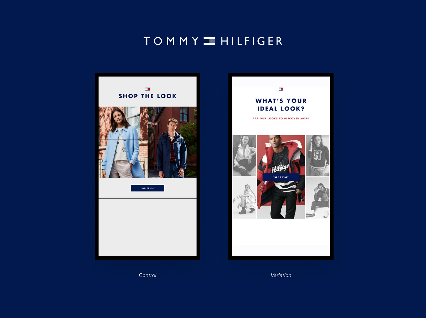
Two fronts, matching the two hypotheses. For getting noticed: non-permanent floor signage (footsteps leading to the kiosk), directional cues, and redesigned idle screens for each range (Basics, Denim, Accessories, Total Looks), built to look worth touching rather than to inform. For being usable: a simpler, device-specific browsing and ordering flow, designed for a screen you stand at rather than a website scaled up, and a "pay on your phone" step, because nobody wants to enter card details on a ten-foot screen in public.
The designs went through multiple rounds, tested as interactive prototypes with shoppers in-store between rounds.